In an increasingly account-centric environment, modern marketing and sales teams rely on tracking digital engagement at the account and individual levels to gauge interest and measure buying intent.
However, we typically rely on a combination of weaker 1st and 3rd party signals, like page views, search intent, and form fills, that require a high degree of assumption (e.g., "they landed on the content download page so I'll just assume they actually read the content"). Based on incomplete data, these inferences do an inadequate job of illustrating true levels of target account engagement.
Our customers constantly remind us just how important engagement insights are to them and how Folloze uniquely positions them to take best next steps because they can see a real-time view of engagement that is far deeper and more accurate than what they measure today. With this release, we want to bring the same granular approach we take to tracking per-person engagement to the account level. For use cases that are ABM-aligned or involve sales participation, this out-of-the-box way to view real-time engagement, aggregated at the account level, enables marketers and sellers alike to align on the same metrics and decide on next steps collaboratively.
Starting today, the Product team at Folloze is extremely excited to make the brand new Account Engagement Dashboard available to all users.
Watch the video below for a quick recap on what this means for you and how to get started, or scroll through the rest of the announcement to get caught up at your own pace.
Getting Started
All Accounts
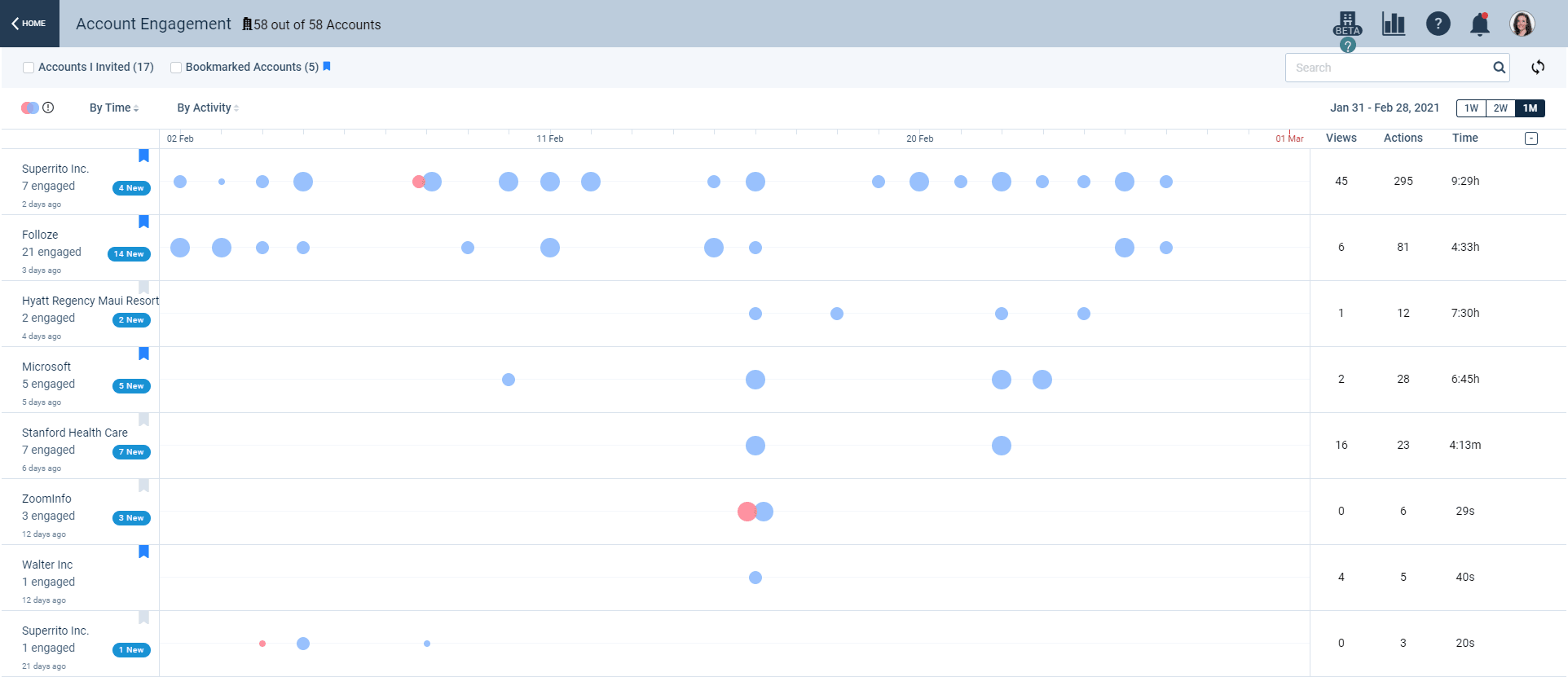
The first view you'll see is best for quickly gauging which accounts have significantly high or low levels of engagement within a recent time period. You'll see a list of all accounts that have engaged with any of your organization's Boards, and by default, this list of accounts is sorted so that the first record at the top represents the account with the most engagement within the selected time period. (For a more specific definition of how engagement is being defined and stack ranked here, hover over the 'Actions' column title.)
Within each account, colored bubbles are a visual indicator of engagement within a single day, sometimes by a single individual and other times by a group of individuals. The size of a bubble represents the level of activity based on number of 'Actions' recorded. Blue bubbles represent a visit or set of visits to Boards by members of that account, and red bubbles represent outbound activities from members of your own team(s) in the form of email campaigns executed within Folloze.
Hovering over any of these bubbles reveals more details about the account's activities within that specific day.
At the top of the page above all the account records, you can take advantage of a number of sort and filter options to narrow down the account list.
Tip: For easier access to your own named or aligned accounts, bookmark the appropriate accounts and filter by 'Bookmarked Accounts' in the future.
Single Account
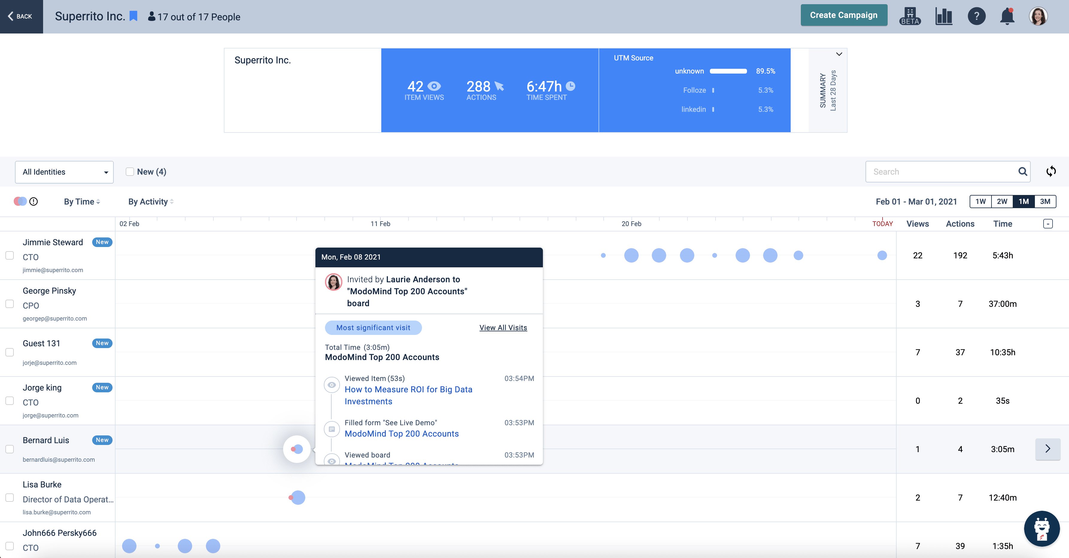
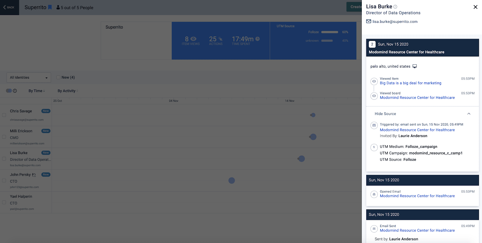
Selecting an account from the All Accounts view brings up the next drill-down, which reveals a complete list of individuals within that specific account that have a history of engagement. Here you will be able to view person-level engagement, identify candidates for next steps, and easily add contacts to a Folloze campaign.
On the left-most column of the dashboard, you'll find a list of people within the selected account. Known people will display a name, title, and email address, and unknown people will be represented by either 'Guest' or 'Person' and will be labeled 'inferred' if IP-to-Account was used to associate their visit to this specific account.
If you'd like to create a new email campaign as a next step for any contact or group of contacts, select the relevant contact(s) by clicking the checkbox on the left of each individual's name and then click 'Create Campaign' at the top of the dashboard.
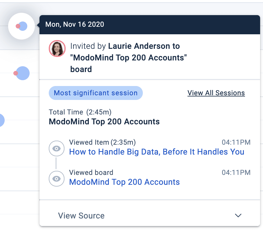
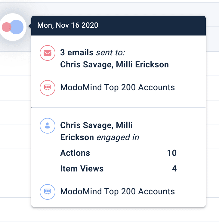
Similar to the previous view, colored bubbles are used to visualize activities that occurred within a specific day. Blue bubbles represent an individual's own engagement, and red bubbles represent an outbound email campaign that was executed by Folloze. Hovering over any of the bubbles will reveal the most significant visit of the day, which is based on the number of actions that occurred within that visit.
Clicking "View Source" within this hover-over view of bubbles allows you to see if a visit was triggered by a specific email campaign and any associated UTMs that were being tracked within that visit.
Activity Stream
If you'd like to drill down and view the full history of a person's past engagement, clicking on a single individual will open the Activity Stream sidebar. The Activity Stream aggregates a person's complete journey across different Boards and different visits.
Some of the information you will find here includes:
- Records of all Board visits w/ Board names
- Full list of activities taken during visits
- Contact info (either known or inferred)
- Applied UTMs for source tracking and campaign attribution
It's everything you love about the Pulse Table aggregated at the person-level. That means that you're seeing a person's entire engagement history spanning multiple touchpoints and channels.
FAQs
This dashboard is awesome, but I'm concerned about seller adoption. Is it possible to make the the Account Engagement Dashboard visible within CRM where my sellers already work?
- Yes. For Salesforce and Dynamics 365 customers, the Account Engagement Dashboard can be made available directly inside CRM.
- For help getting the started with the installation, please contact your Customer Success Manager.
Some people's records are labeled 'New'. What does this mean?
- If a person is labeled 'New', that means they had their first-ever engagement within the selected time period.
- Note: Receiving an email does not count as engagement in this case. Engagement refers to an activity performed by this individual, such as item views, form fills, or Board visits.
How do you determine the most significant visit of the day?
- The most significant visit represents the visit with the most activity for that day. This is an aggregate measure of all activities within days and visits.
I would like easier access to just my own named accounts (e.g., I'm a seller or I'm on an ABM team). Is there a way to make this happen?
- Yes. On the 'All Accounts' view, simply bookmark your named accounts by clicking on the bookmark icon next to the Account name within the left-most column. In the future, you can toggle the 'Bookmarked Accounts' filter at the top of the dashboard to see just your accounts.