Q3 2024 Product Spotlight
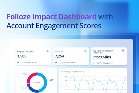
This Product Spotlight features the Folloze Impact Dashboard and Account Engagement Scores, which empower go-to-market teams to clearly demonstrate the effectiveness of their strategies and make informed decisions. These tools simplify complex data into actionable information. They enable informed decision-making, and help marketers assess campaign effectiveness and account engagement in real-time.
Introducing the Folloze Impact Dashboard
Get the insights you need to make smarter decisions quickly with the Folloze Impact Dashboard. Easily demonstrate the success of your marketing campaigns and initiatives to anyone in your organization with Account Engagement Scores and detailed supporting data.*Watch a high-level video overview of the Impact Dashboard above.
The Impact Dashboard simplifies advanced behavioral buyer data into clear, actionable insights, helping confirm the effectiveness of your campaigns and quantify your impact on sales and revenue. Plus, Account Engagement Scores provide valuable insights into the health of your sales pipeline and potential revenue while enabling you to tailor your buyer journeys more effectively.
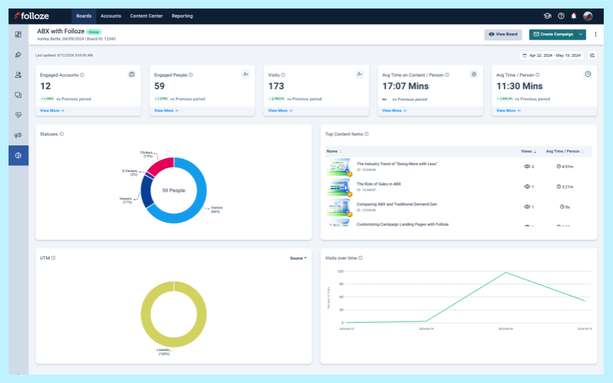
You can access the Impact Dashboard directly on any of your Boards. With the Board-level view (shown left), you can quickly check performance, campaigns, content, and more for that specific Board.
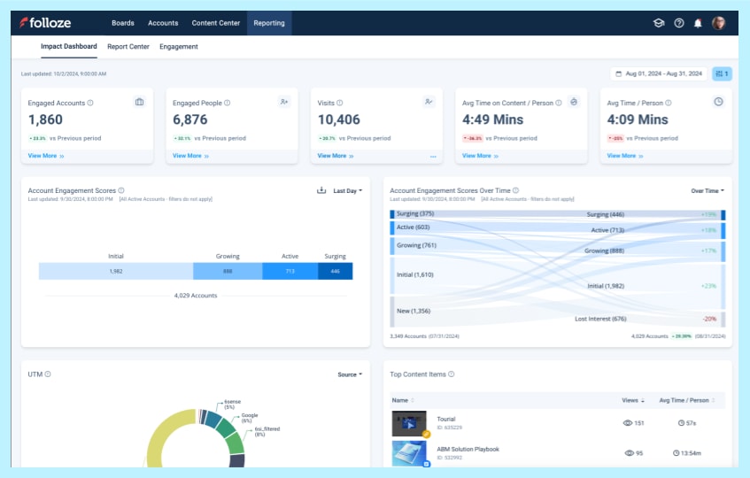
Or, for a more comprehensive view of overall performance, you can access the Company-level view of the Impact Dashboard available under the Reporting Tab (shown left). It features Account Engagement Scores, as well as cross-Board, and cross-campaign performance metrics.
The Impact Dashboard allows you and your team to more easily spot trends, report program successes, and access the detailed data that supports them.
Listen to the story your data tells and use it to guide your team to success.
Below, we dig into some of the data visualizations available via the Impact Dashboard.
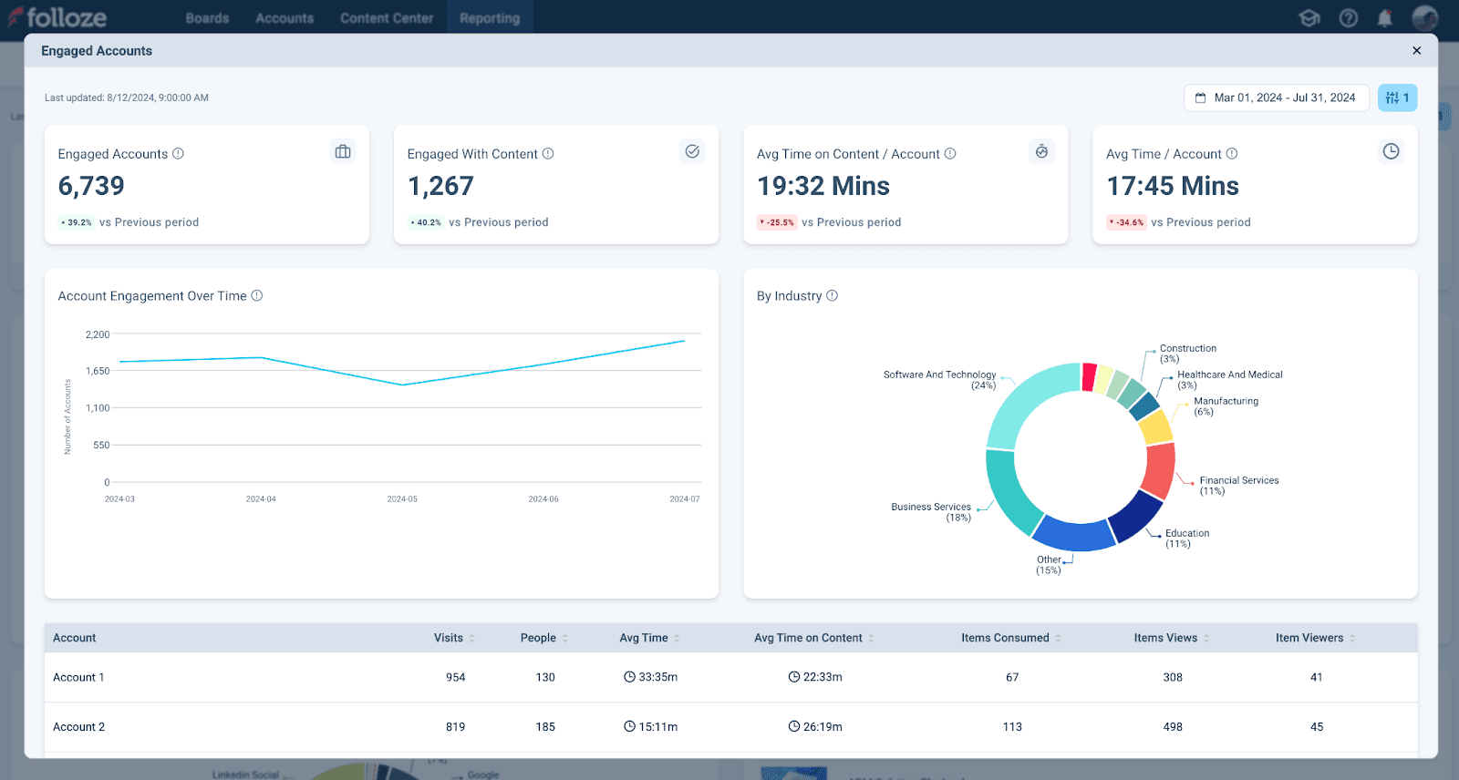
Engaged Accounts & Engaged People:
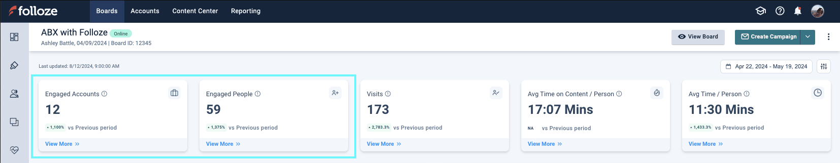
*The top bar of the Impact Dashboard shows the Engaged Accounts and Engaged People widgets (highlighted above). They display the total unique accounts and people that had at least one person engage with the Board.
Pinpoint which accounts and prospects are most engaged with the Engaged Accounts and Engaged People widgets. Consider customized follow-up strategies based on who is actively engaged (or who is not) to increase engagement and build stronger relationships.
Click the View More button under Engaged Accounts to see additional related information and trends. For example, Account Engagement Over Time, Accounts by Industry, and more (shown below).
Visits, Visits Over Time, & Average View Time:
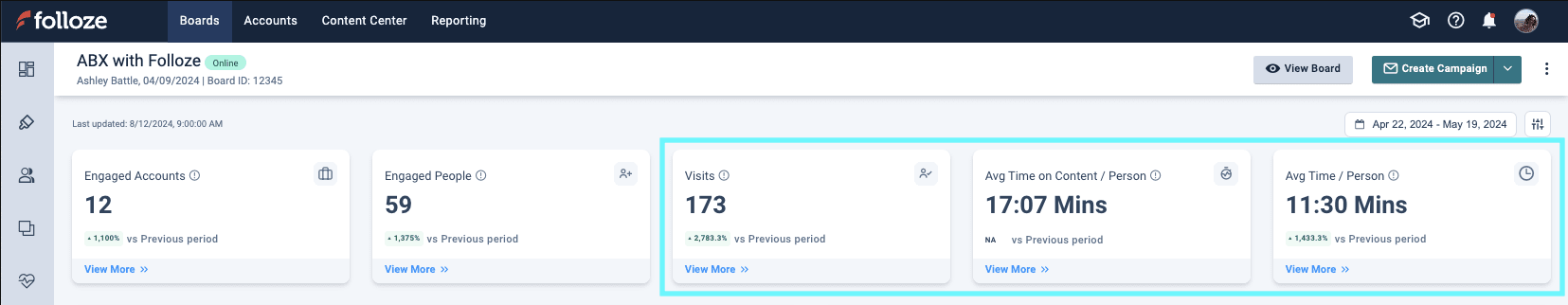
*The top bar of the Impact Dashboard also shows the Visits, Avg Time on Content, and Avg Time / Person (highlighted above).
Review "visit" and "view time" data holistically. If your Board shows a short average view time, it may indicate that the Board’s design, copy, or content isn't capturing the interest of prospects landing there. On the other hand, if your Board isn’t getting the number of visits you expect (but engagement levels are reasonable) this suggests that your Board is effective once prospects get to it. In this case, consider adjusting your campaigns to improve click-through rates or use other methods to boost visibility.
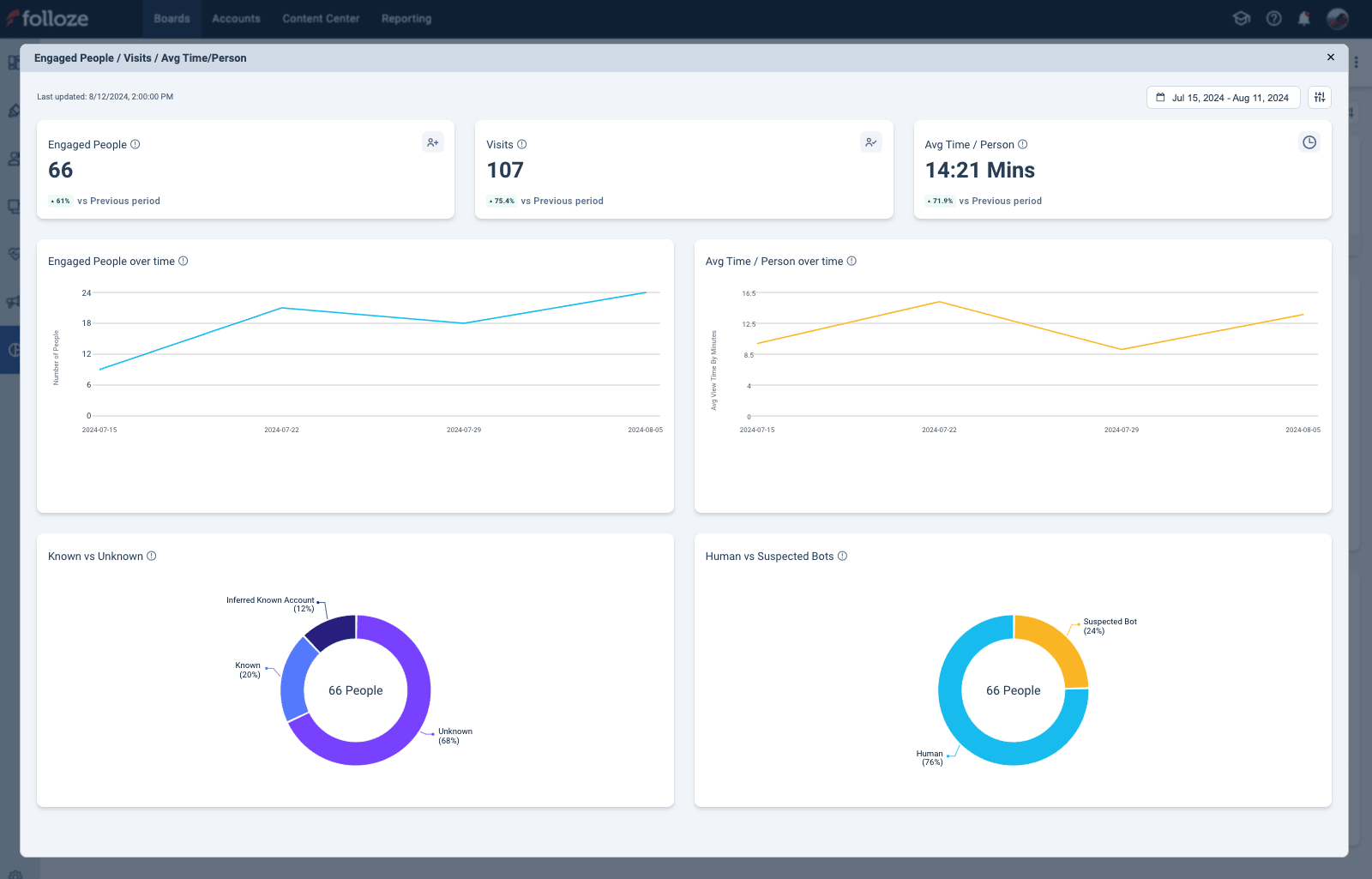
Click the View More button under Visits to see additional related information and trends. For example, Engaged People Over Time, Average Time per Person, and more (shown below).
Top Content Items & Average Time on Content:
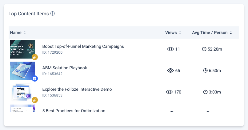
*Top Content Items widget. Sorted by Avg Time / Person.
How do you measure the effectiveness of your content? Identify which content items are working with Top Content Items and content view times. If a particular content type or topic is performing well, you can adjust your content strategy and produce more content in that format or explore related topics to keep your audience engaged. View your content consumption analytics with filters that specify a campaign or account to get even more granular insights!
UTMs:
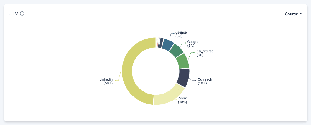
*UTMs widget that breaks down the URL parameters that prospects landed with. Filtered by UTM Source.
Track which marketing channels are most effective with UTM data. If you find that most traffic comes from a specific social media campaign, you could increase your investment in that channel or replicate the strategy in other campaigns.
Detailed Filtering:
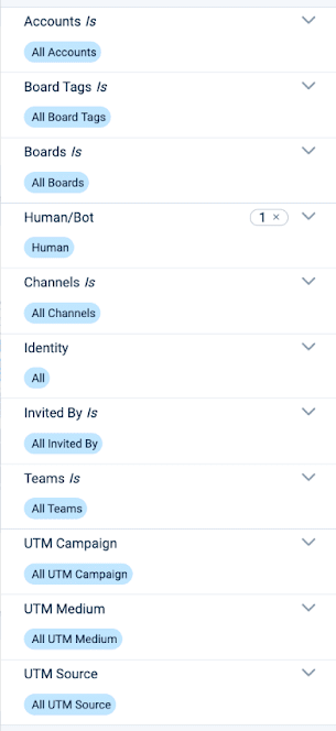
The Impact Dashboard provides advanced filtering options that let you customize your data visualizations and identify even more nuanced insights.
You can filter by time, account(s), UTM(s), inviter(s) and more. Make sure each chart is relevant and useful to you by adjusting your filters. Isolate data from a particular campaign to evaluate its success or focus on certain accounts to track engagement levels and pinpoint opportunities. Plus, use filters to compare results with past performance metrics, identify trends, and make informed decisions. Impact Dashboard data is updated each hour so you know you’re getting a current understanding of performance.
Want the details on each datapoint and filter? Visit your Impact Dashboard or read our comprehensive Impact Dashboard Help Article.
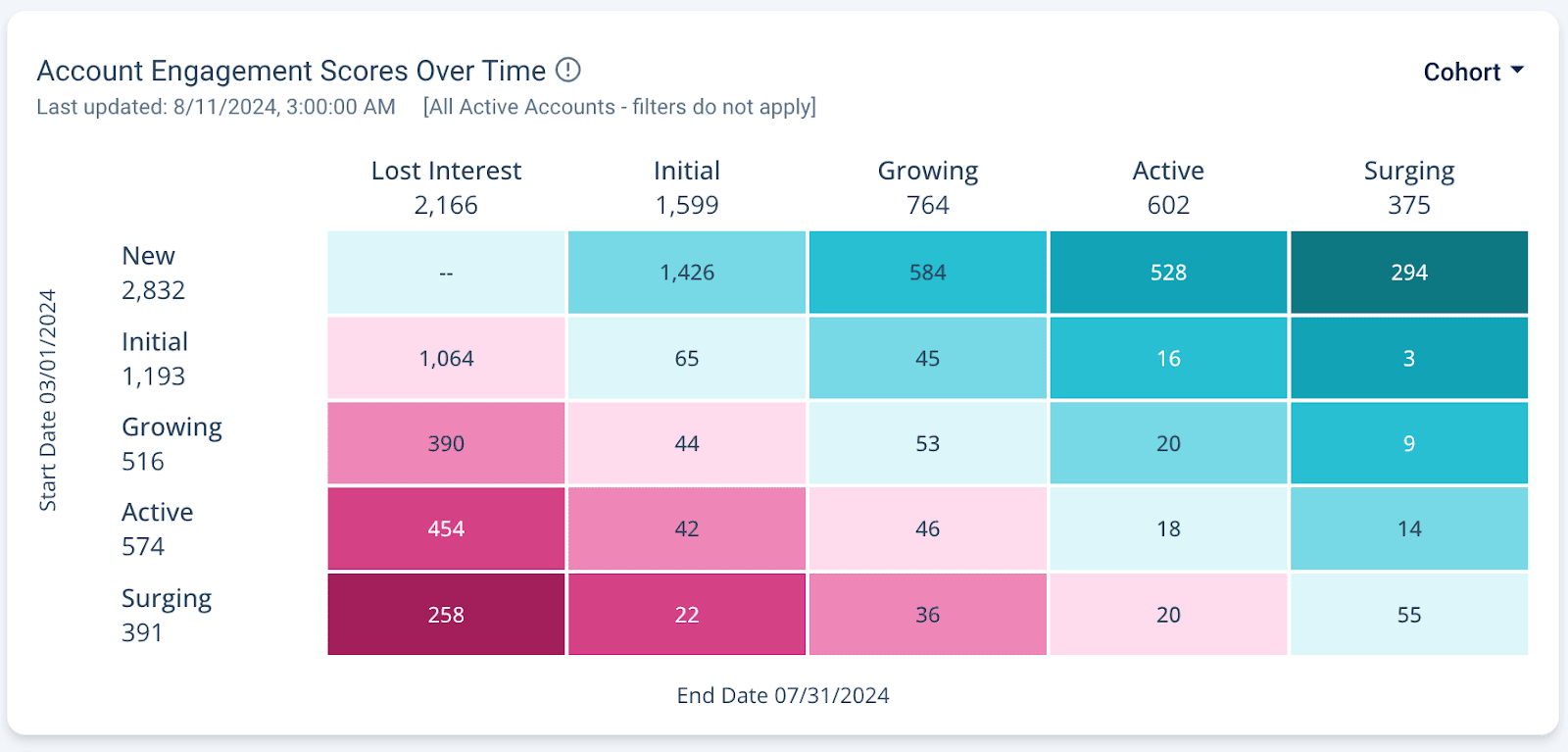
Account Engagement Scores:
Unlock the full potential of every buyer interaction with the insights you need to deeply understand each prospective account, drive effective team actions, and close more deals faster with Account Engagement Scores.
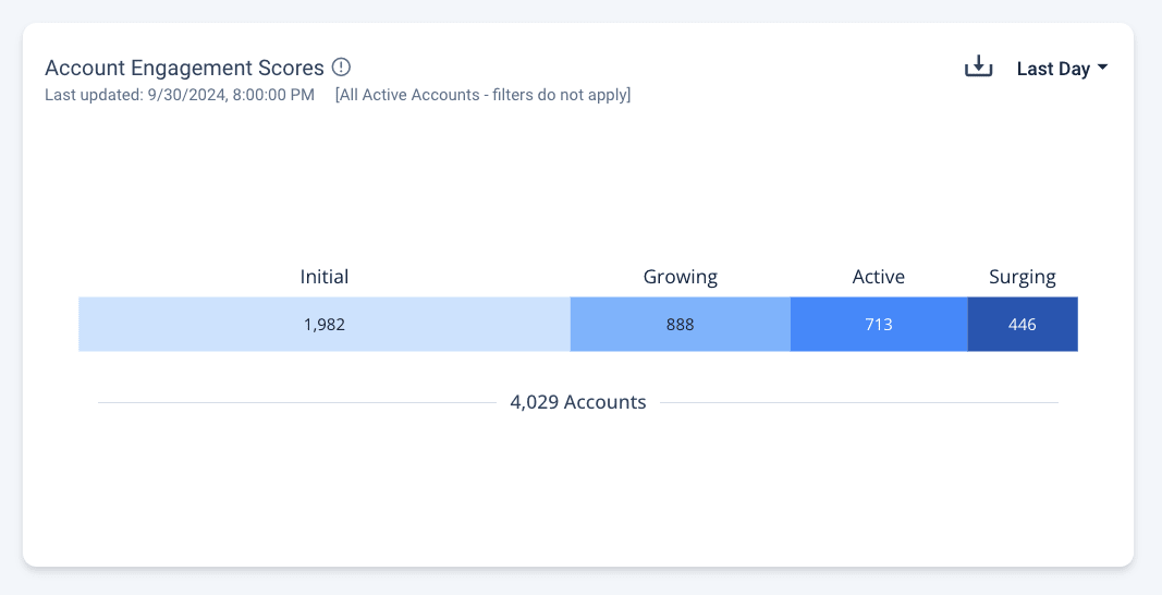
Account Engagement Scores are visible from the company-level view of the Impact Dashboard (shown above).
All of your accounts are assigned one of the following scores:
- New - newly joined accounts
- Initial - accounts that have shown interest
- Growing - accounts that are actively engaged with Boards
- Active - accounts that spend more time on Boards
- Surging - the highest level of account and prospect engagement
Scores are calculated with a multi-dimensional model based on account and prospect behavior and interactions throughout the buyer journey. This model incorporates various metrics such as content views, time spent on boards, time spent on content, intent-driven calls-to-action, and prospect volume. Recent engagement is more heavily weighted to keep scores current. Scores are also updated daily to maintain relevance and accuracy. Please note that scores are calculated for all active accounts and are unaffected by any filters other than date range.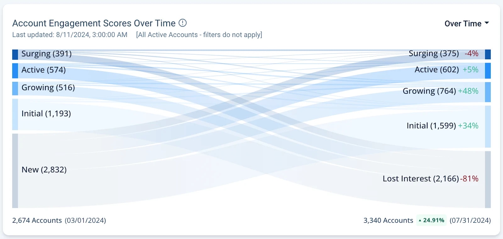
View your Account Engagement Scores Over Time (shown above) and even see their exact movement with Cohort view (shown below). Change your view using the top-right dropdown.
Get actionable intent and engagement insights for your accounts and prospects across Boards and campaigns. Whether you’re replicating the success of past campaigns, or fine-tuning your goals for next quarter, the Impact Dashboard packages your data into the insights you need to make smarter decisions for your team, deliver sales-ready accounts, and present to anyone at your company.
Visit your Impact Dashboard in Folloze by clicking Reporting!
Report Center
Even though we're introducing the exciting new Impact Dashboard data visualizations, you can still download the raw data (CSVs) from the Report Center.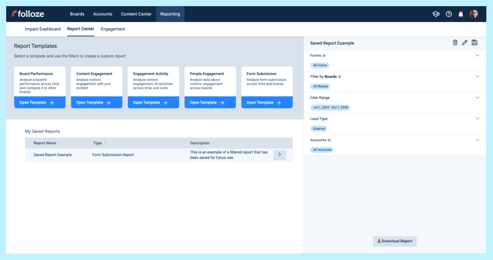
*A screenshot of the Report Center Report Templates and a Saved Report (above).
Access, customize, and save various reports to fit your specific requirements. For example;
- Your Engagement Activity Report displays each activity performed on a Board (or Boards). See who viewed an item, who clicked a link, and more. Use this report to review more granular engagement data for accounts or specific users. Or see common actions taken on a Board.
- Your Form Submission Report displays detailed form submissions data for a Board or Board(s). Use this report to quickly download specific form-fill data, including any custom and/or hidden fields on forms.
You can still access, customize, and save various reports in the Report Center. Download them as CSVs at any time. In combination with the Impact Dashboard, your data presentations will be a breeze to build.
Folloze Academy
Are you enrolled in Folloze Academy?
All Folloze users have access to Folloze Academy courses.
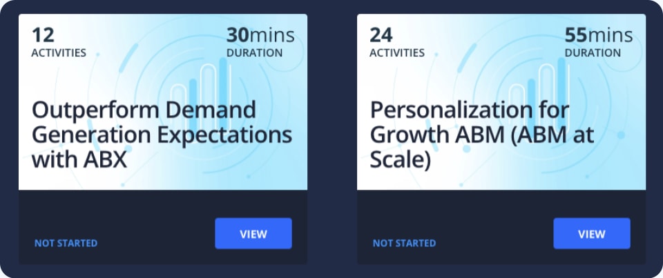
Improve your ABX strategy and strengthen your approach to personalization with our newest courses available for Folloze users. Or, Get started with Folloze ABX Campaigns.
- Outperform Demand Generation Expectations with ABX (30min)
- Personalization for Growth ABM (ABM at Scale) (55min)
As always, thanks for reading!
The Folloze Product Spotlight includes updates on featured product enhancements and best practices. Feel free to reach out to us with questions or feedback at product@folloze.com.